
If you’ve been using Flexbox or CSS Grid, you already know how to build awesome layouts without the headache of floats. Feels good to get them out of your life, right? Not so fast: floating elements can be awesome with the power of the shape-outside property.
shape-outside on a float allows you to wrap inline content around a shape instead of a floated box boundary. So what does that mean? Let’s check it out:

Woah! See ya later straight lines. How do we do this?
.circle {
  float: left;
  margin-right: 4.38rem;
  width: $circle;
  height: $circle;
  shape-outside: circle();
  border-radius: 50%;
  background: #D0D0D0;
}So, what’s the code doing here? Let’s take a look.
Out of the styles above, we only need to pay attention to three things: our float, width/height and our shape-outside property. First, we need to float the element so that it wraps our content. Second, we need to define a width and height for the browser to know how and where to wrap the content around our shape. Third, we need to define our shape-outside property, which, in this case, is a circle basic-shape.
That’s it! Now, a circle is cool, but what about other shapes? We can also use inset, ellipse and my favorite, the polygon. Polygon allows us to create complex editorial layouts for the web with ease. With that in mind, let’s take a look at a polygon example:

Cool! But let’s look at our code:
.kick-it {
  float: left;
  margin-right: 3.13rem;
  width: 50rem;
  height: 100%;
  shape-outside: polygon(57% 74%, 47% 80%, 40% 50%, 38% 37%, 41% 0, 31% 0, 9% 0, 11% 35%, 23% 41%, 24% 80%, 34% 78%, 41% 88%, 49% 88%, 61% 89%, 63% 85%, 61% 77%);
}Woah, woah, that’s a lot of coordinates in our polygon. How do we figure those out? We could do the coordinate system manually, but there’s an option to make our lives easier.
Check out this cool clip-path generator. You can create your own custom polygon, and draw paths on a custom image, like I did here:
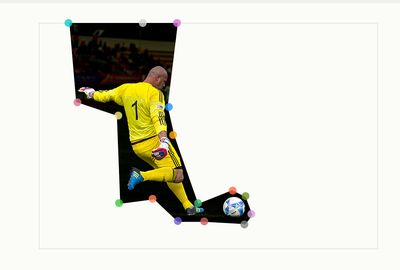
While it’s a clip-path in the tool above, both clip-path and shape-outside utilize the same basic-shape property, so copy and paste your coordinates, and you’ll be good.
Welcome to the dark side.
You can even animate the shape-outside property. The only limitation is that due to its coordinate system, you need to maintain the same number of points for this to work.
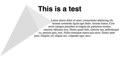
How do we do this? First we have our shape-outside defined:
shape-outside: polygon(50% 0%, 0% 100%, 100% 33%);
Then we define our animation:
animation: 2s clippath infinite alternate ease-in-out;
Finally, for our animation, we alter the last polygon point to change our shape:
@keyframes clippath {
  0% {
    shape-outside: polygon(50% 0%, 0% 100%, 100% 33%);
  }

  100% {
    shape-outside: polygon(50% 0%, 0% 100%, 100% 100%);
  }
}
Why would you ever want to do this? That’s a mystery to me, but it’s always cool to know you can. Maybe you want to ressurrect the marquee element for your sweet new Geocities page; I do not judge.
So there we have it, the shape-outside property empowers us to break out of the box that is most of the web and create awesome editorial designs we usually only see in print. Who knew floats could be cool?


