
There are a handful of tutorials out there that explain how to use Drupal's responsive image and breakpoint modules. However, from what I could find, none of them address how to instruct Drupal to output simple <img> tags that leverage srcset instead of using the <picture> element. Using srcset can be preferable in many circumstances and as such, knowing how to use it in Drupal will be good for most developers to understand. Since I was so confused on how to make this work, I thought it would be worth sharing.
Why srcset over <picture>?
Others have done a much better job explaining the "why" of this approach, namely Chris Coyier and Jason Grigsby. Read those posts for the full picture (heh) but suffice to say, if you're only needing to change the resolution of an image at different viewport sizes/densities, you should use srcset instead of the <picture> element. If you need images that vary more specifically (i.e. different croppings, styles, etc.) then you should use the <picture> element. The reason srcset is preferred, is that it allows the browser to make informed decisions about which version of the image to serve, whereas the <picture> element explicitly tells the browser which images to use and when via media queries. Browsers know way more about our end users than we (developers) can ever know, so why not let them make the hard decisions?
In short:
- Use
srcsetfor different image sizes/densities across breakpoints. - Use
<picture>when you need separate art direction/crops across breakpoints.
Convincing Drupal to Use srcset
Drupal's UI for responsive images is confusing and (maybe) rightfully so. Responsive images are confusing. As a rule, Drupal tries really hard to not make assumptions about what the user needs. While I understand why we (the Drupal community) built core this way, this can lead to interfaces that even seasoned professionals have a hard time understanding. In this case, it wasn't clear to me how (or if) I could instruct Drupal that I just wanted an <img> element with srcset and sizes, not a full <picture> element. Each method I tried produced a <picture> element.
After some digging, I found the core issue where this development and discussion occurred. After skimming that thread and poking around the accepted patch, I knew that what I wanted was possible, but I still couldn't grok how to configure things in Drupal to get the desired output.
Further digging revealed that the default template responsible is called: responsive-image.html.twig. Here is the full file that ships with the Stable base theme:
{#
/**
 * @file
 * Theme override of a responsive image.
 *
 * Available variables:
 * - sources: The attributes of the <source> tags for this <picture> tag.
 * - img_element: The controlling image, with the fallback image in srcset.
 * - output_image_tag: Whether or not to output an <img> tag instead of a
 *   <picture> tag.
 *
 * @see template_preprocess()
 * @see template_preprocess_responsive_image()
 */
#}
{% if output_image_tag %}
  {{ img_element }}
{% else %}
  <picture>
    {% if sources %}
      {#
      Internet Explorer 9 doesn't recognise source elements that are wrapped in
      picture tags. See http://scottjehl.github.io/picturefill/#ie9
      #}
      <!--[if IE 9]><video style="display: none;"><![endif]-->
      {% for source_attributes in sources %}
        <source{{ source_attributes }}/>
      {% endfor %}
      <!--[if IE 9]></video><![endif]-->
    {% endif %}
    {# The controlling image, with the fallback image in srcset. #}
    {{ img_element }}
  </picture>
{% endif %}
The key in this template is the output_image_tag boolean. When true, the template renders an <img> tag instead of the <picture> tag. Inline documentation within the responsive_image module's template_preprocess_responsive_image() function explains that this output_image_tag variable is true when:
There is only one source tag with an empty media attribute. This means we can output an image tag with the srcset attribute instead of a picture tag.
In this context, Drupal is basically saying: if the user hasn't setup multiple breakpoints for this style AND there isn't any specific media query attached. Or in other words, the user doesn't want the theme to determine the images served but wants to put that onus on the browser via srcset.
Solution
If your use-case is to of the "resolution-switching" variety, here is how you get the desired output (no picture element) within Drupal:
- Skip creating specific breakpoints in your theme, they aren't needed with this approach.
- Setup your different image styles at
admin/config/media/image-styles. Usually something like, Author Small, Author Medium and Author Large. - Create a responsive image style at
admin/config/media/responsive-image-style. Make sure the Responsive Image module is enabled first.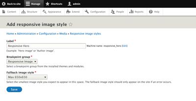
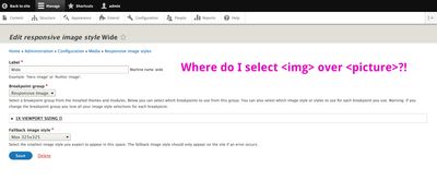
- Ensure "Responsive Image" is selected for the "Breakpoint group".
- Choose a suitable "Fallback image style". Click "Save". The following screen is where the secret sauce is.
- Under the "1x Viewport Sizing []" fieldset, Select "Select multiple image styles and use the sizes attribute."
- Select each of Image styles you'd like to use.
- Adjust the Sizes value as needed. The default here
100vwis hard-coded for a good reason, it's a pretty sane default and works well in most situations. Customize this is you want even finer control. More on Sizes.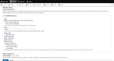
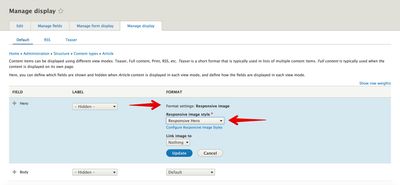
- Adjust your content type (or other entity) to use your new responsive image style either by altering the display formatter or handling programmatically.
- Verify results!
For a thorough explanation of how all of the bits of the Responsive Image module work, see the documentation at admin/help/responsive_image with the Help module enabled.
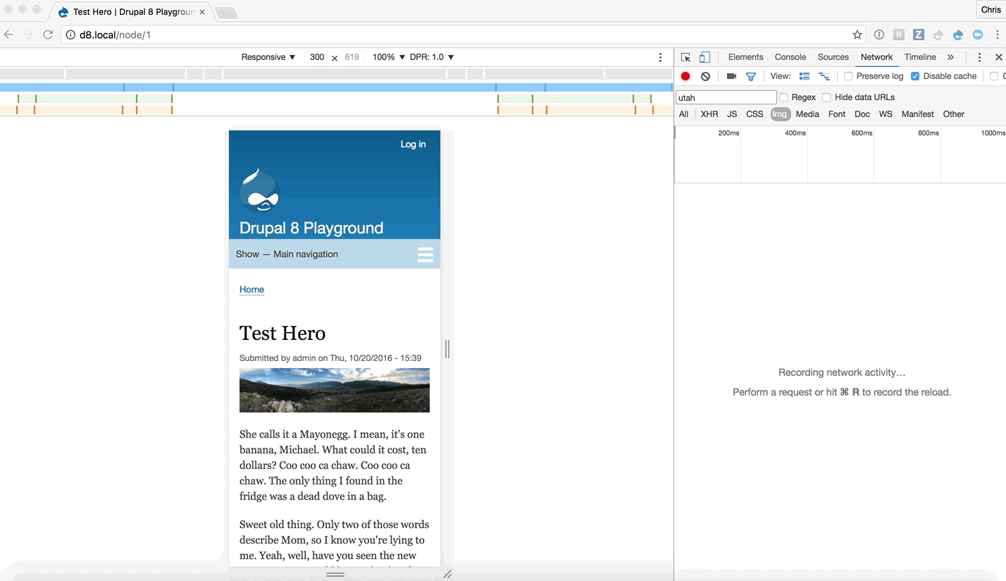
You should see something like this for the output of that image field now (formatted for readability):
<img
  property="schema:image"
  srcset="/assets/images/articles/styles/max_325x325/public/2016-10/utah.jpg 325w, /assets/images/articles/styles/max_650x650/public/2016-10/utah.jpg 650w, /assets/images/articles/styles/max_1300x1300/public/2016-10/utah.jpg 1300w, /assets/images/articles/styles/max_2600x2600/public/2016-10/utah.jpg 2600w"
  sizes="100vw"
  src="/assets/images/articles/styles/max_650x650/public/2016-10/utah.jpg"
  alt="Ogden, Utah Panorama"
  typeof="foaf:Image"
>
We now have an <img> element with a srcset attribute containing paths to each of our image styles, a sizes attribute and a fallback src attribute which points to our fallback image style.
Now our browser will automatically determine which image to serve up based on the client's viewport size, pixel density, etc. Also, if the client's browser doesn't yet support srcset, it will simply fall back to the value set in the src attribute.
Armed with this knowledge, you can configure your Drupal sites to leverage the power of srcset and allow the browsers of the world to do the hard work of determining which image style to serve to your users.


