Style guides and UI toolkits butter my bread. When combined, they compartmentalize design into modular components that allow you to prototype a system rather than paint a mockup. Within the awesome open source space, there are a ton that are freely available, but I’ve found one that shines above the rest: Fabricator.
I love Fabricator because it’s easy to set up, gets out of your way and is super customizable. It’s definitely worth a try, so let’s get you set up and started.
Installation
To install Fabricator, open up your terminal and run this where you would like your project to live:
curl -L https://github.com/fbrctr/fabricator/archive/master.tar.gz | tar zx --strip 1When done downloading, you can install Fabricator by typing:
npm start
This will install all the node packages required to run Fabricator. You don’t need to worry about how this works, but if you’re interested, here’s a great run down.
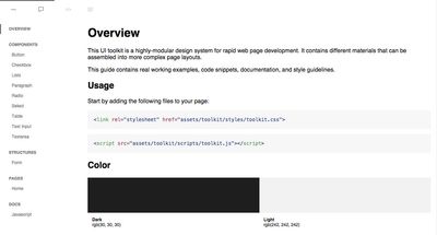
Alright! Fabricator will start a local host using Browsersync, and you should see a default page looking similar to this:
Now that we have Fabricator up and running, let’s go over three key folders inside of the /src file structure. This will illuminate how Fabricator will work for you.
Materials
Materials form the foundation of our prototyped pages. Every folder comprises a new section in our toolkit, and every document will add a new material.

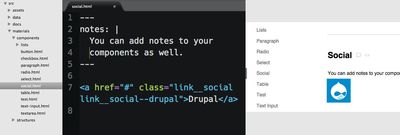
Want to create social media components to drop in our pages? Create a new HTML document called social.html inside of our components folder (components/social.html), write the markup like you normally would, save, and marvel at the ease of your modular design.
I usually build out all the components first so that my pages can be quickly populated. Speaking of which...
Views
The structure of the views folder reveals two ideas that we need to understand to effectively use Fabricator: pages for our materials and pages themselves. Let’s examine both.
Pages for materials.
The HTML documents at the root of the views folder tell Fabricator where to find our materials. Let’s say you wanted to create a new section in your toolkit for branding - items like logo treatments, colors and typography. Save a new file named branding.html in the views folder and follow the pattern of the other pages located here, like components.html for example.
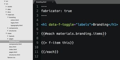
Pay attention to this line:
{{#each materials.branding.items}}
With materials.branding, we’re letting Fabricator know to output every HTML document (item) in the materials/branding folder.
Pages for prototyping.
Say we’ve built all our components and structures, and we’re stoked to bring these pieces together to prototype some awesome pages. Alright, let’s get to it.
Building pages follows the same pattern as making new component materials: creating a new HTML document. All your pages will live under the pages/ folder, and a default page home.html is included on installation. Time to start building out your pages, and the next part is where Fabricator shines.
Let’s say we know we’re going to build several pages that all use the social component we built in the materials section of this article. Pasting in the HTML could get out of hand quickly. What if it changes down the line? Fabricator’s got you covered.
{{> social}}
This line outputs all our markup from social.html in the materials/components folder. If you ever decide to change your markup in social.html, Fabricator will automatically use the updated version. Apply this approach to all our materials, and we’re assembling our pages in no time.
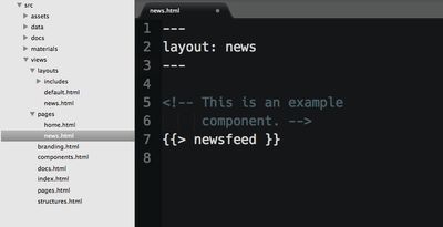
You can also customize the HTML that wraps all of your page documents. Inside of views/layout is default.html — this is, as you guessed it, the default HTML that is applied to all pages. Save this file with a new name; we’ll use news.html as an example. Make the changes you want, and drop the following in whatever /pages documents you’d like to inherit our new layout:
Other Folders
Now that we’ve covered the three most important ways Fabricator will assemble your prototype, let’s check out the other folders.
Assets
The home for all your images, JavaScript and SCSS. I enjoy dividing my styles to reflect the structure of the materials folder and import everything in toolkit.scss.

Data
The data folder lets you build reusable snippets for mock data. It accepts JSON and YAML files. I rarely employ this feature, but I could see it being useful. To provide a simple example, let’s say you wanted a header title without copying and pasting it every time. You could create a lorem.yml file and paste the following:
title:
  "Lorem Ipsum Dolor Sit Amet."
Then, anytime I have a header in my page prototypes:
<h1>{{lorem.title}}</h1>
<h2>{{lorem.title}}</h2>
Docs
Docs are a collection of markdown files that hold any documentation you’d like to pass on.
Get Fabulous
I sampled a lot of design systems when deciding what to use, and Fabricator sang to me from the start. Give it a try. With its flexibility, it may be exactly what you’re looking for. But don’t take my word for it: