
The web is an inherently accessible thing. The way a browser renders HTML elements out of the box (i.e. without any styling on our part) errs, for the most part,[1] on the side of accessibility. For example:
- Default contrast between text and background colors is high.
- Elements are rendered in the order in which they appear in the markup.
- Form controls are easy to identify and operate using a variety of input methods.
- Links are easy to identify, and afford the user with different colors to distinguish links the user has visited from those the user has not.
- Element focus is easy to discern.
There are many more examples of default design affordances that build accessibility into the web right out of the box, but this last item (element focus) is of particular interest to me. The way we treat element focus on the web is a good example of how we often sabotage accessibility—which we otherwise would get by default—in the pursuit of aesthetics.
It’s not a bug, it’s a feature.
Browsers will highlight an element that’s in focus by drawing an outline around said element. Here’s how Chrome does this:
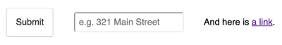
A button, text field, and link, with Chrome’s default focus indicator.
This isn’t particularly offensive with unstyled (or minimally styled) elements, but when a web project has been painstakingly designed without these outlines in mind, it can throw a wrench into an otherwise pixel-perfect design.
Chrome’s default focus state is unambiguous, yet aesthetically unpleasing.
That’s OK, though, because the purpose of the outline is not to please, but to clarify. Right? Technically speaking, yes, but in my experience designers and stakeholders often see it as an eyesore, as something to be corrected. This is easy to accomplish with a tiny bit of CSS, but—as is often the case—we should ask ourselves not just whether we can do something, but whether we should do it.
You see, when we remove that outline, we also remove a user’s ability to determine unequivocally that an interactive element is in focus. A handful of form control elements (some input types, textareas, etc.) indicate focus indirectly via a flashing cursor, but they are in the minority. Focus placement remains largely under the radar when the default outline is removed. Keyboard users of all stripes—from those using a keyboard because they prefer it to those who simply have to—are affected by this.
A pervasive anti-pattern
I’ve lost count of the number of times I’ve been asked to “please remove the blue outline/dotted line” around interactive elements. It’s such a common request, in fact, that the world’s most popular reset stylesheet (i.e. the Eric Meyer reset) originally contained the following block:
/* remember to define focus styles! */
:focus {
  outline: 0;
}
That rule has since been removed, but the fact that it was once there (and that it remained there for about three years) is indicative of how common this request actually is. And, I would argue, its removal from the stylesheet indicates that developers largely ignored Meyer’s behest to define focus styles.
Sadly, and perhaps more importantly, this CSS rule is still thrown at websites indiscriminately across the web, which demonstrates how this browser feature is still largely regarded as if it were a bug. I’ve thought about this issue a lot on a number of levels; from why it happens in the first place, to whose responsibility it should be to prevent it (hint: it’s everyone’s responsibility). In my opinion, the bottom line is this: The whole thing can be avoided if we design things correctly in the first place.
Take control of focus states.
Our very own Gideon Kreitzer said it best when I first pitched this article:
Design should be the first line of defense for accessibility.
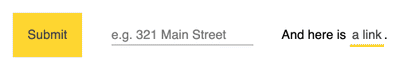
And I couldn’t agree more! As designers, we are in a unique position to bake good accessibility practices and careful consideration of user experience right into the design from the start. In the case of focus states, we can have the best of both worlds if we include custom focus states for all interactive elements. Here’s what our custom button, input, and link might look like with a dedicated focus state for each:
By designing custom focus states, we produce a more cohesive graphic language that enhances the user’s experience without limiting the accessibility capabilities of their device.
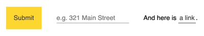
As you can see, different elements may be addressed in a variety of ways. In this example, we have:
- A button with no hover state, and a dedicated focus state.
- A text input with hover state indicated by the cursor, and dedicated focus state.
- An anchor element with a focus state that piggybacks on the element’s already-established hover state.
We can take different approaches depending on the way an interactive element is used and whether they have some form of hover state indicator (be it by default, or custom-built). This gives us the opportunity to establish an even stronger graphic language across our entire design system, reinforcing our brand and increasing a user’s confidence that what they’re seeing is an accurate representation of the state of an application or site.
A note on Firefox
Firefox’s focus indicator is a bit particular:
As you can see in the GIF[2] above, buttons styles don’t get the outline property, but rather a pseudo-element (::-moz-focus-inner) styled with a border property using a dotted line. If you’re providing custom focus indicators for buttons, you’ll need to add this to your CSS:
button::-moz-focus-inner {
  border: 0;
}
Be the first line of defense.
As designers and stakeholders, we should hold ourselves and each other accountable so that the impacts of our design decisions are considered carefully and steps taken to make sure we do right by our users. While it’s perfectly valid to want our web products to look their best, we should also seek to make them behave their best. Often times we can elevate a user interface by going above and beyond the defaults, and as you’ve seen above focus states afford us just such an opportunity.
I hope I’ve inspired you to make focus state design standard practice. If you have any thoughts or comments, or you’ve seen focus state patterns worth sharing, drop us a line on Twitter!


