Every Drupal site contains the spinning circle of progress - the "throbber". Click on anything requiring Ajax and you'll often be greeted by the standard blue Drupal throbber while waiting for results. There have been many times that I didn't even realize I was using a site built with Drupal until it made an appearance.

Run away!
Seeing the default throbber on an otherwise beautiful site takes away from the magic a bit, doesn't it? While you're surely proud your site is built with Drupal, don't you want to give your visitors a completely unique experience? You've worked so hard perfecting every other pixel, why settle now? Go the extra step and create a custom throbber to keep your visitors immersed in the world you've created for them. It's too easy not to!
All you need is:
- an hour or two
- Photoshop or a similar gif editor
- access to your theme's file system and CSS
- a bit of patience
Here we go!
Creating your own animated progress throbber graphic

First, you'll want to decide on what your graphic will be. If you have a circular logo or icon that works well at very small sizes, that's perfect. You can get creative here, but it should continue to convey the same idea of progress while spinning for your visitors. It should also remain visually appealing at very small sizes. For ours, we're going to use the hexagonal C mark from our logo.
How these throbbers work
Next, you'll want to gain an understanding of how the default throbber works. The throbber is an animated gif graphic that is strategically positioned with CSS while other elements are loading. If you've never looked for it before, locate the root of your Drupal installation and find /misc/throbber.gif.
Open the throbber.gif at /misc/throbber.gif in Photoshop. Notice how there are twelve layers and only one is visible. In the Photoshop menu, navigate to "Window > Timeline". This window is the magic behind how the gif works and will become your best friend.

In the Timeline window, you'll see twelve frames, each one corresponding to one of the layers. Click on each frame and you'll notice a different layer is visible for each. Finally, underneath each sequence you'll see '0.06'. That's how long (in seconds) that frame will last before moving to the next. They don't all have to be the same, but it makes sense for them to be in this situation.
Setting up your Photoshop template
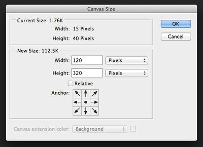
Now it's time to have fun. Save a copy of throbber.gif somewhere else and open it in Photoshop to start digging in. The first thing I'd recommend doing is making your image canvas much larger than it already is. In the Photoshop menu, navigate to "Image > Canvas Size...". I'd typically set mine to 120 pixels for the width and 320 pixels for the height (the original dimensions multiplied by 8). Having more pixels to work with will allow you to tweak the positioning and size of your graphic with much more control. We'll shrink it down to the right size when we're done and want to save it.
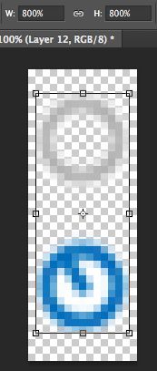
You've increased your canvas size, but the Drupal throbber remained tiny. Make sure you're on the active layer and frame and navigate to "Edit > Free Transform..." in the Photoshop menu (or use CMD/CTRL + T). Now, near the top of the window, set the new height and width to be 800% of the original dimensions. Hit enter and it should now take up most of the frame again. It will be really blurry, but that's ok. We're only using it as a template for placement and won't be exporting it. Repeat this for every layer/frame. An important thing to remember is that every time you switch to a different layer, you'll want to switch to the matching Timeline frame, too. This can be tedious and confusing, so here is a Photoshop CC file with a magnified template already created.
Getting your graphic in the Photoshop template
The next step is to get your graphic into the Photoshop template we've created. Whether it be copying and pasting from elsewhere, or by using "File > Place", import your graphic in as a new layer. Using the Timeline window, make sure this new layer is only visible in the first frame (click between frames and toggle layer visibility). Move it around and resize it until it's perfectly on top of the blue Drupal throbber on the bottom.
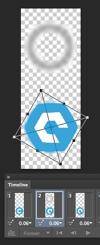
Now duplicate the layer with your graphic and use the Timeline window to make the new layer only visible in the second animation frame. Now we rotate it. Just like the Drupal graphic, each frame will be an additional 30 degrees of rotation from the frame before it. So in the second layer/frame, rotate the original graphic 30 degrees using the Transform tool. While using the tool, hold shift and grab the top right arrow with your cursor to rotate it. As you rotate, it will tell you how far you've gone and will snap to helpful increments.
Repeat this step until you've got twelve layers visible in the right frames and filled with your graphic progressively rotated. If you've done it right, the twelfth will be 30 degrees away from matching the first. Make sure to go through each frame one more time and make sure only the correct frames are visible. For an example, here is our Photoshop CC file after adding and rotating our custom graphic.
Adding the greyscale graphic to the top of the template
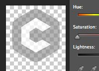
That takes care of the colored spinner, but we need to replace the grey one, too. Duplicate the first frame with an upright graphic. Make the original Drupal throbber visible again (any layer/frame works) and move your newest graphic on top of the grey circle atop the original throbber graphic. Again, the size and position should be as close as possible to the original. Now create a greyscale version of it by using "Layer > New Adjustment Layer > Hue/Saturation...". In the menu that pops up, desaturate it all you'd like. Making the original layer semi transparent will help, too. Tweak the values until you're happy with the darkness. Unlike the colored graphic, this one layer should be visible on every Timeline frame and should never be rotated.
If you're still with me, we're just about there! Your colored graphic that will spin should be in the correct place on all 12 layers/frames and the greyscale version is in all of them as well. Go ahead and delete the layers with the original Drupal throbber. All that should be left are the graphics you've added. Here's our Photoshop CC file with a finished throbber.
It's alive!
If you click the play button in the Timeline window, you should see your graphic spinning. You may need to pay attention to particular frames that need adjusting if the spinning graphic feels off balance in any way. Other adjustments, such as adding more space between the grey and colored graphics, may also be necessary later.
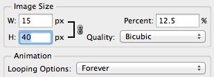
Finally, let's save it for use. Using "File > Save for Web...", select "GIF" for the type. Make sure "transparency" is checked and, most importantly, adjust the size. Give it a width of 15 pixels and a height of 40 pixels. This matches the original throbber's size. Click 'Save' and save it to somewhere you'll remember. Open it and make sure it spins and looks great.
You'll notice ours looks a lot like the default graphic, but that is because of the nature of our mark. Yours should look completely different!
Adding the graphic to your theme
Only a few small steps left and they are the easiest.
Move your new throbber.gif into your theme's file structure. Something like /sites/all/themes/yourtheme/images/throbber.gif.
Next, somewhere in your theme's CSS, add these lines:
/* Overrides /modules/system/system.base.css with a custom throbber. */
html.js input.form-autocomplete {
  background-image: url(/sites/all/themes/yourtheme/images/throbber.gif);
}
.ajax-progress .throbber {
  background: transparent url(/sites/all/themes/yourtheme/images/throbber.gif) no-repeat 0px -18px;
}
It's important to change the image path to the location and name of your new throbber. These lines will override the uses of the default throbber within Drupal's System CSS to use your throbber instead. You may want to look in whatever contrib modules you are using to see if they have styles for throbber.gif that you need to override, too. We've had to do this for the flag module in the past.
You're done!
Save your CSS (or Sass, LESS, whatever) and clear cache. Click around somewhere that uses a throbber (Ajax, autocomplete, etc.) and see the magic in action. If the positioning is a bit off, try tweaking the background-position in the styles you've just pasted in as overrides.
Update 10/22/13: We've been informed that there is an open issue to either separate Drupal's default throbber.gif into two images or to increase the amount of space between the top and bottom graphics. If you're having trouble positioning your throbber within a textfield so that only one is visible at a time, you may want to try one of these techniques. You'll then want to adjust your CSS to match the changes.
That's it! Show it off to the world! You've got a custom progress throbber!
Did this help you create one? Leave a comment with a link! Have a question? Ask away!


