
Rebranding our company
I am so excited this day has finally come. Today, you’re looking at a brand new Chromatic – we’ve refreshed our identity completely, redesigned our website, and perhaps most importantly, revamped how we present ourselves to you.
tl;dr – our old brand did not feel authentic to who we are, who we've become, and where we're going. We started over to fix it and we love where we ended up.
Why’d we Rebrand?
Well the tl;dr above cuts right to the core of it: our old brand no longer represented the company we had become nor the company that we’re working towards. It did not represent our values, culture, or personality. Worse yet, the brand’s rules kinda only lived in my head, which had a way of changing over time. If you only knew us through our previous website, you probably came away feeling like you’d just left the dentist. It wasn't terribly friendly, and in some ways felt cold and sterile. Those that know us personally (usually) have a completely different feeling. That incongruence isn’t great.
What truly pushed us to make this change?: the old branding and website did a shit job of communicating just why you should care about Chromatic. What do we actually do? What are we good at? What have we done? It was all clear as mud.
So we’re starting over! What you see today is the result of over a year of work resetting the company – our positioning, our visual identity, everything. A total reset.
How’d we do it?
Positioning
Chromatic has always been a generalist organization. We don’t specialize in any specific industry or technology (though we have our favorites) and we don’t particularly want to. The diversity in our clients, the tools we use, the languages we write code in, is by design – it keeps things from being too boring.
We recognized the value specialization could bring and sought out a consultant, David C. Baker to help us narrow in on new positioning for Chromatic. While it felt common to us, among the hundreds of digital agencies out there, we are unique in our skills at leveling up other teams. We have been doing it since the beginning.
While there’s no shortage of “implementers” and “rent a devs” out there, we’ve always done things differently. We’ve never just taken a spec and just implemented it. We’ve always tried to dig deeper with our clients. We want to teach them how to do it better, faster, more efficiently; not just building what they want, but figuring out what they need – then building that.
Though we always have and always will look for interesting projects where we can make an impact, we’re leaning into what we do best - being a partner to agencies without digital teams, where our expertise in building web applications and platforms can level them up.
The Brand
Once we finally decided that it was time to start over with the brand identity, we reached out to our network for brand designer recommendations. After a careful search and a dozen or so conversations, we ended up choosing the fabulous and talented Jessica Jones.
Jessica patiently took us through a number of exercises to reveal who we are and what we’re all about. Most of what we discovered, we already knew, but it was striking and exciting to put all down on paper and to really see it codified. Themes of integrity, trust, mentorship, and delight kept coming up and are now the roots of our new brand.
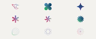
Among the most authentic parts of the new brand is our jewel toned color palette (Chromatic means “produced by color” after all). The color palette draws its inspiration from nature – specifically, the iridescence of hummingbirds. And the more we learned about these tiny creatures, the more we realized they embodied some of the best qualities of our team. They are nimble, fast, efficient, and smart (we've heard they have the largest brains, relative to their size, of any bird).

Jessica helped us land on an overall brand aesthetic that feels fresh and approachable. We have all of these fantastic colors and interesting shapes to play with, coupled with some really nice typography and subtle animations. I just love it.
More to come
So we’re opening a new chapter at Chromatic. We’ll have some more posts in the future surrounding the brand and some of the engineering choices we made for this site, but those are for another day. For now, thanks for stopping by and if you’re keen to, let us know what you think!

